Digital Frontier
Header
Main
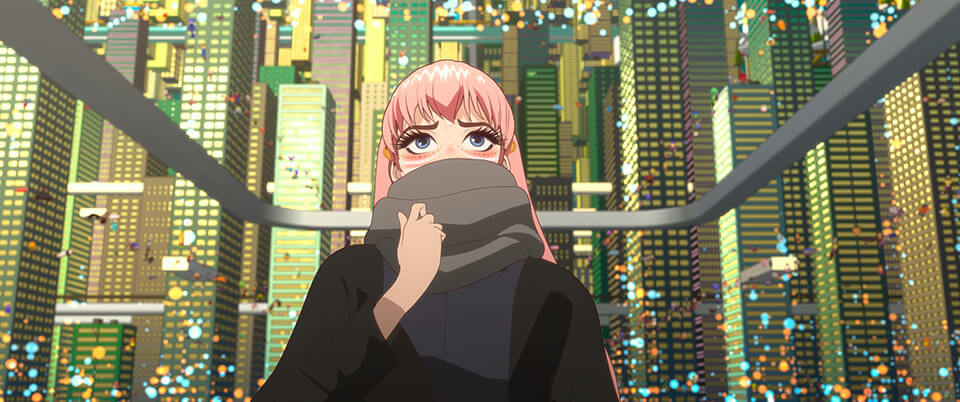
CG MAKING
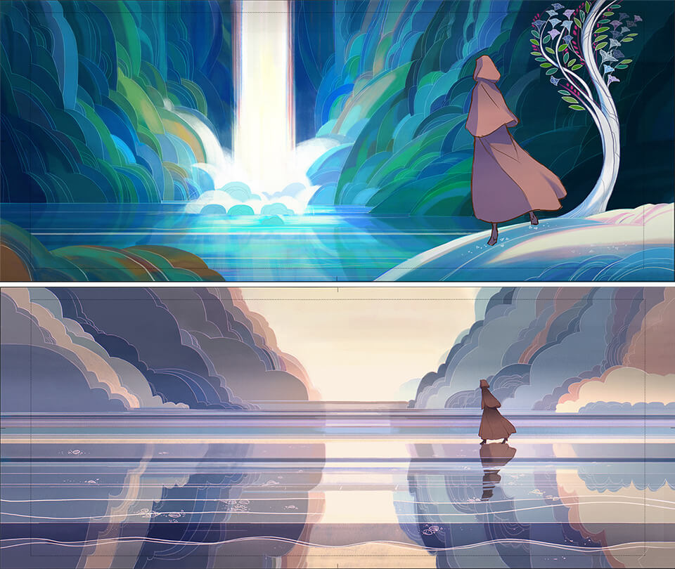
BELLE
july 2021 [CG]
From asset production to shot production
Turning Mr. Jin Kim’s character design into CG
As mentioned earlier, Belle’s character, with her exquisitely emotional acting, was designed by Mr. Jin Kim, a veteran Disney character designer. Character Lead Suguru Sato and Character modeler Chiaki Watanabe describe how Belle’s Disney-esque CG model was created.
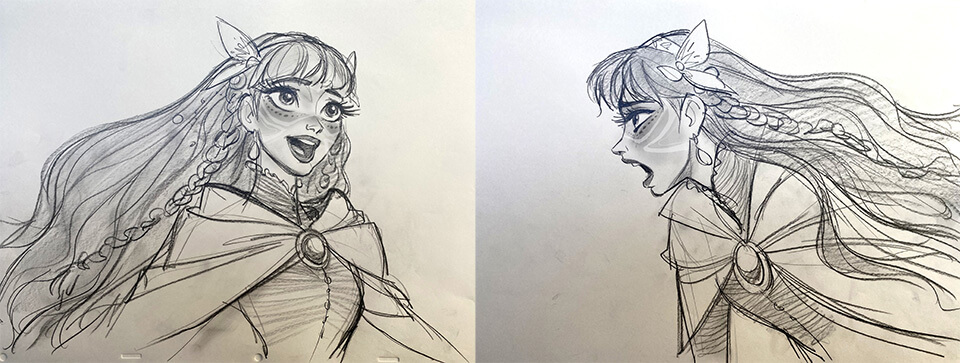
 Cap14:Belle design drawing by Mr. Jin Kim
 Cap15:Belle design refined in an anime-tone by Mr. Takaaki Yamashita
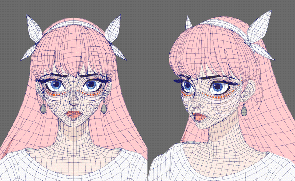
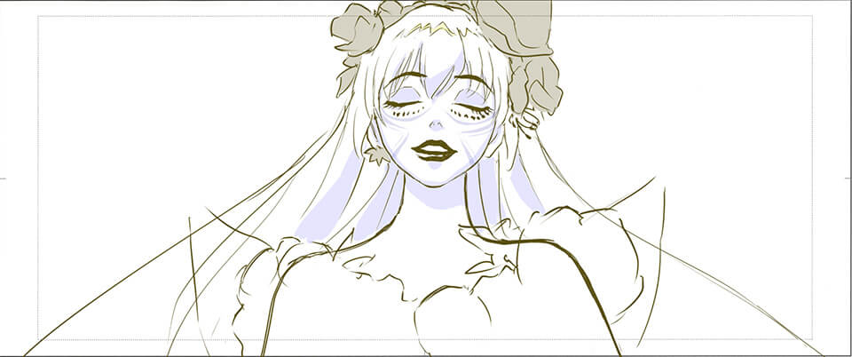
In works previously produced by DF, there had been few other Anime human characters that appeared in feature-length films, so we were feeling our way through character modeling. We had two sets of character designs - one by Mr. Kim that was expressive and Disneyesque, and one by Mr. Yamashita that was Anime style. In the beginning, it was hard to choose one. Belle was set as As whose appearance was based on the main character’s classmate "Ruka." We figured that would mean more of the elements of Anime would come through and decided to reproduce Mr. Yamashita’s designs. There are frontal face and side profile face designs. It was tricky to put these designs together into a three-dimensional shape and we had a hard time with that. When you add as much stereoscopic effect to the frontal face as you would to the side profile face you get too much shadow, and if have as much of the white of the eye showing in the mid-profile face as you would in side profile face, it does not look as pretty. In the end, we prepared frontal, mid-profile and side profile face models. They were then reflected into the face rig. With regards to looks, we paid attention to detailed adjustments, such as the include/exclude line option, to make sure that the impression of illustrations does not get not lost when setting. We used V-Ray Toon to draw lines.
 Character modeler, Chiaki Watanabe
In the initial stage, we were torn between Pencil+4 or V-Ray, but went with V-Ray Toon considering the line stability and efficiency in volume rendering.
 Cap16:Belle’s CG model after modeling
It is very difficult to take a very expressive character design with shading and make it into a character model with an Anime-style look. What points get extracted from the character design and captured into the CG model?
Since the design drawings were drawn with some facial expressions and there was no material for a straight face, it was difficult to ensure that the sense of the whole face was not lost. Hand drawings create asymmetry, which can add to the essence of the face. Making one side look exactly like the other side doesn’t actually improve the face. We made adjustments by taking the average of the left and right and recreated the eye area with slight shading and the fullness of the lips. During the production process, Mr. Yamashita retouched every angle and we used it as reference to further refine shapes. For model specifications, the Facial Team asked not to make topology too detailed, keeping it to a minimum, so we were careful with how the mesh was subdivided. The white of the eye was made as concaved bag and the pupil as a floating disc as requested by the Facial Team. When zooming in on the eyes, shading of the white of the eye and the details of the iris are necessary. We also made a spherical model for close-ups to handle that.
The cheeks and jawline were partitioned in consultation with the Facial Team and we did the partitioning with a special mesh.
Particularly in this project, there were many cuts in which the camera went around the character, filming her from every angle. So we could not use shapes that looked overly Anime-esque, so the shapes were three dimensionally accurate to some extent.
 Cap17:Belle’s facial blend shape
Because Belle’s freckles and the white line on her cheeks could break from their patterns when she changes her facial expression, they are built into the mesh. We had to validate many elements as we worked on Belle and we spend over two months on modeling her face alone.
 Cap18:Rendering image of Belle
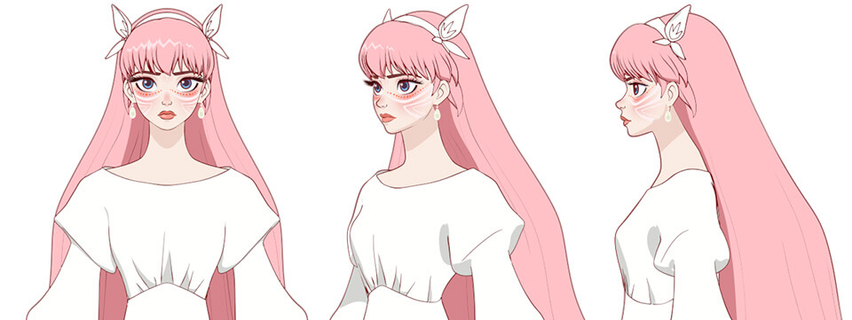
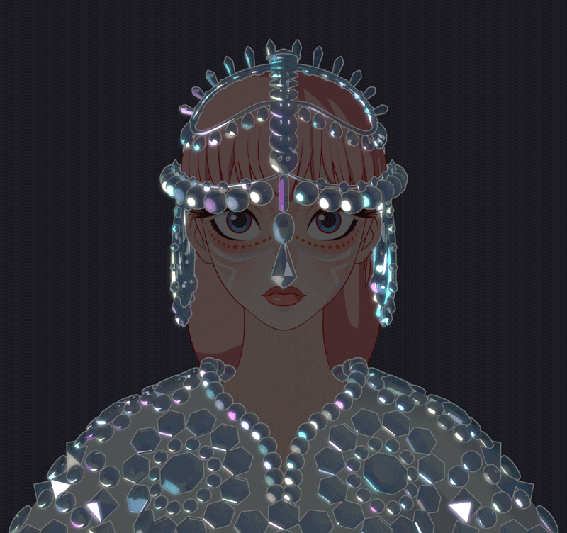
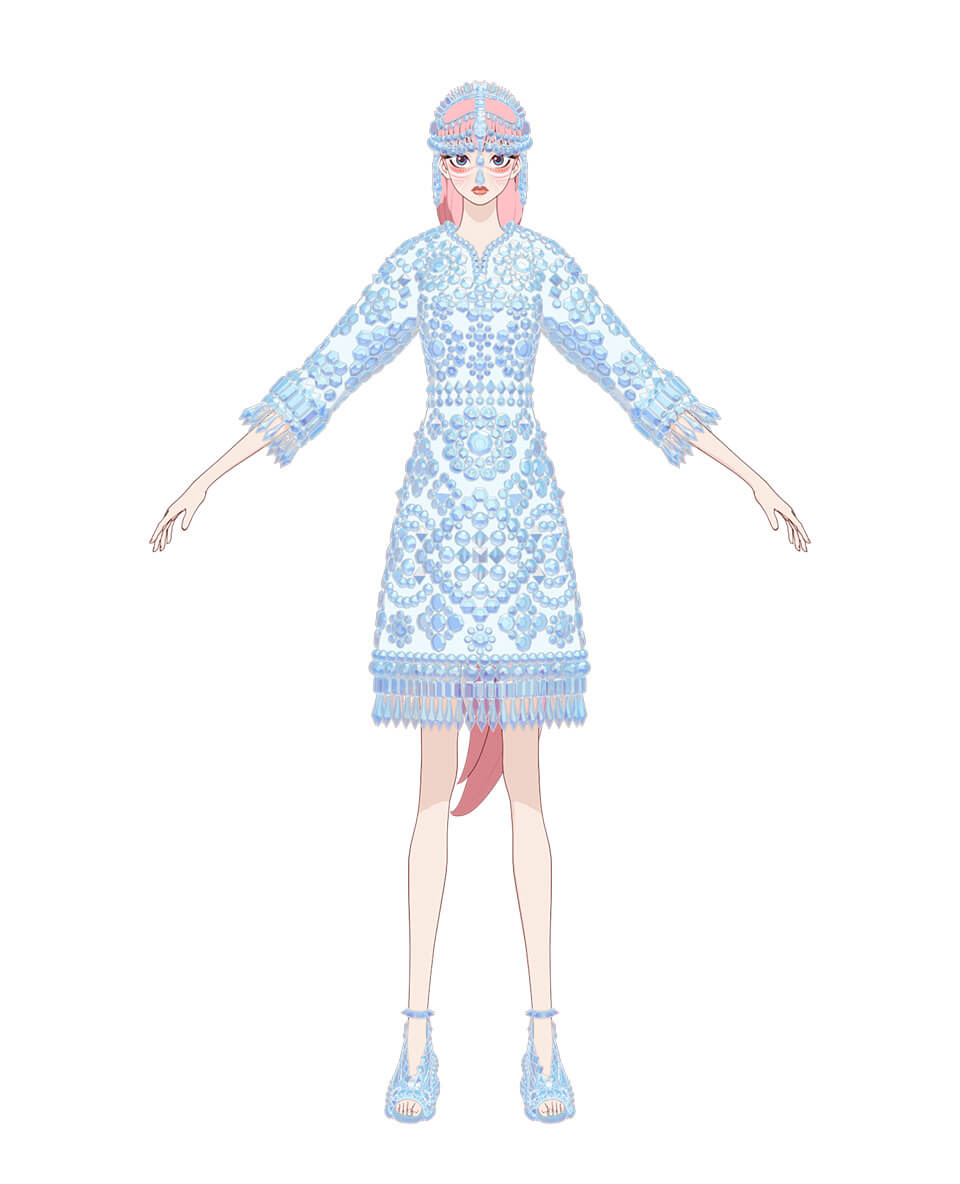
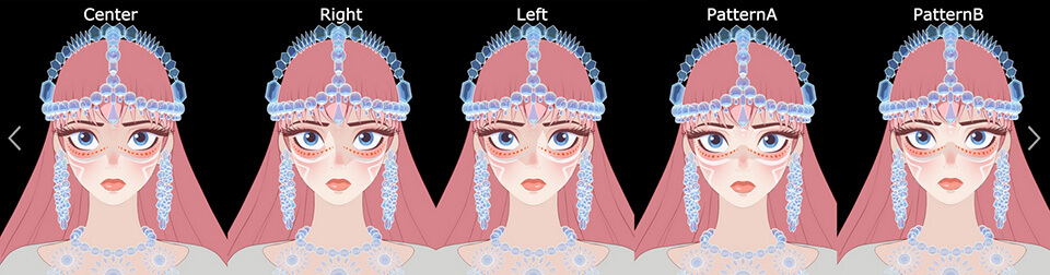
Production of Belle’s gorgeous costumes rich in variations
Belle’s costumes were designed by real costume designers and made into actual costumes. How were they created?
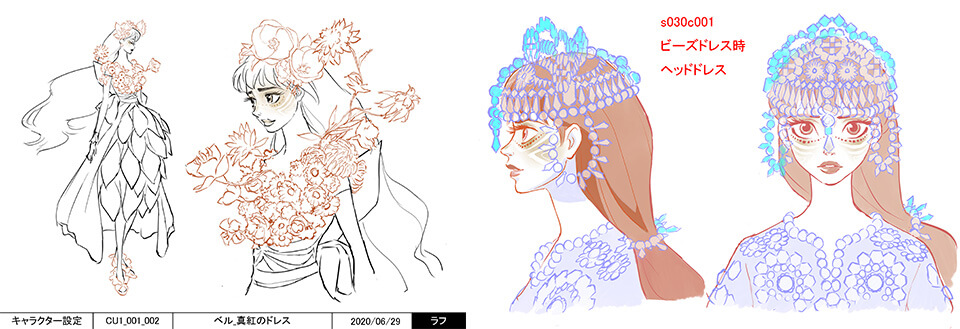
There were a lot of variations in Belle’s costumes and designs were complicated, so it was hard to understand each structure as we worked. What was even harder was grasping the reigning concept that dictated the director’s selection of a particular costume and making fine adjustments. For example, the actual version of the crimson dress was made using fresh flowers. We consulted with Mr. Horibe over and over on whether there was enough texture or there was the right amount of gradation before making decisions. The beaded dress had also been made into an actual dress, which was made with a material that changed color when light was shined from different angles. We started on it by validating how this material looked when it was recreated in CG. Even with the white dress, instead of creating a simple white fabric, we gave a slightly reflective quality and adding some extra elements in toon shading to add richness to the fabric. We had to be careful to avoid overdoing it or the dress would look too CG. Getting the right balance was tricky. The director requested that these dresses be special because they were princess dresses. To make that happen, we needed to be more creative in model making than we would for regular characters.
 Cap19:Costume material test image
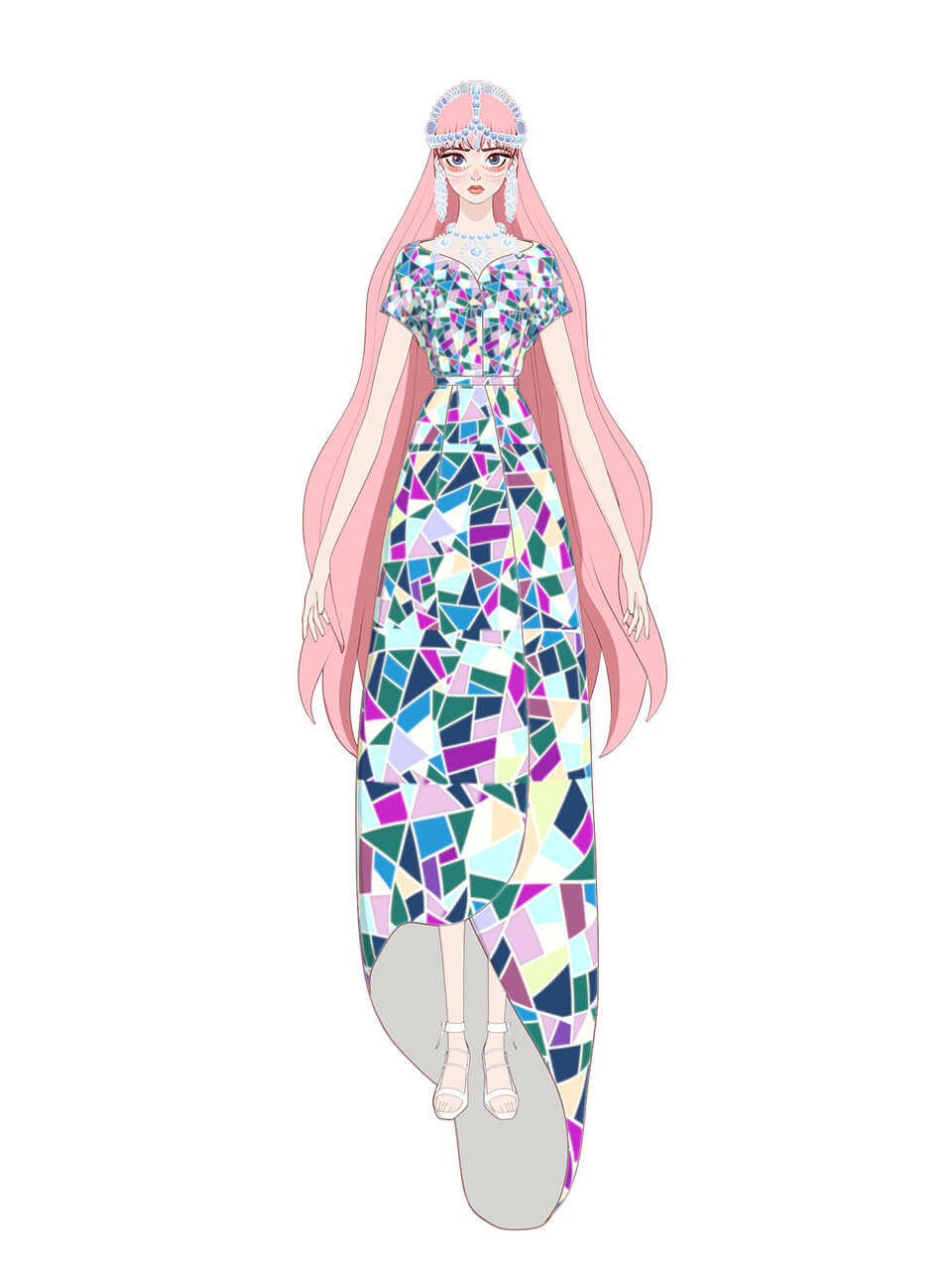
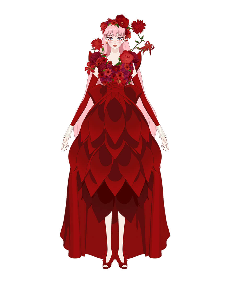


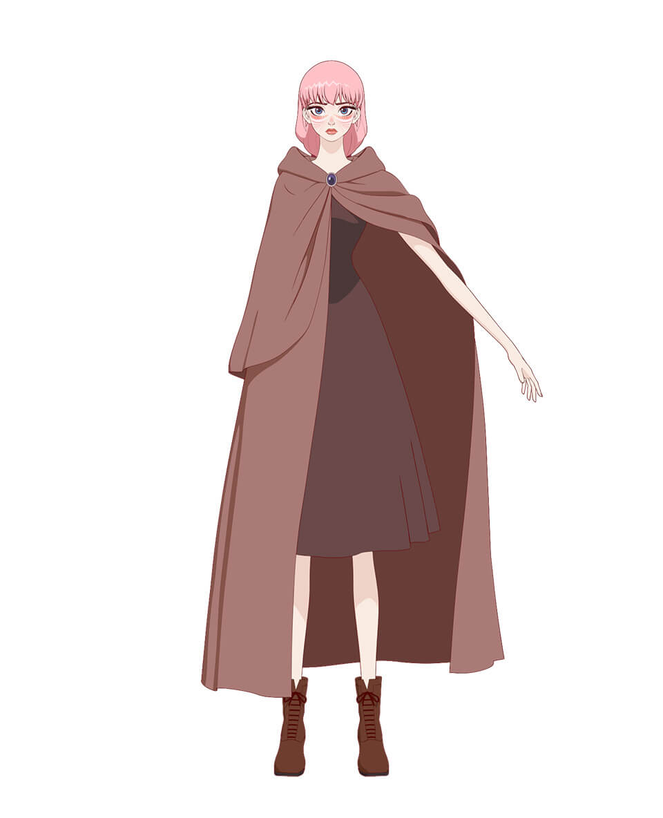
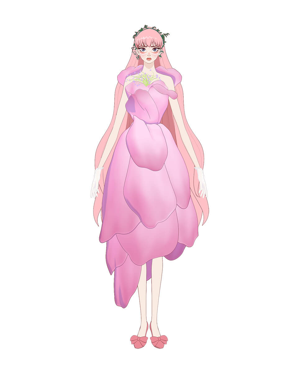
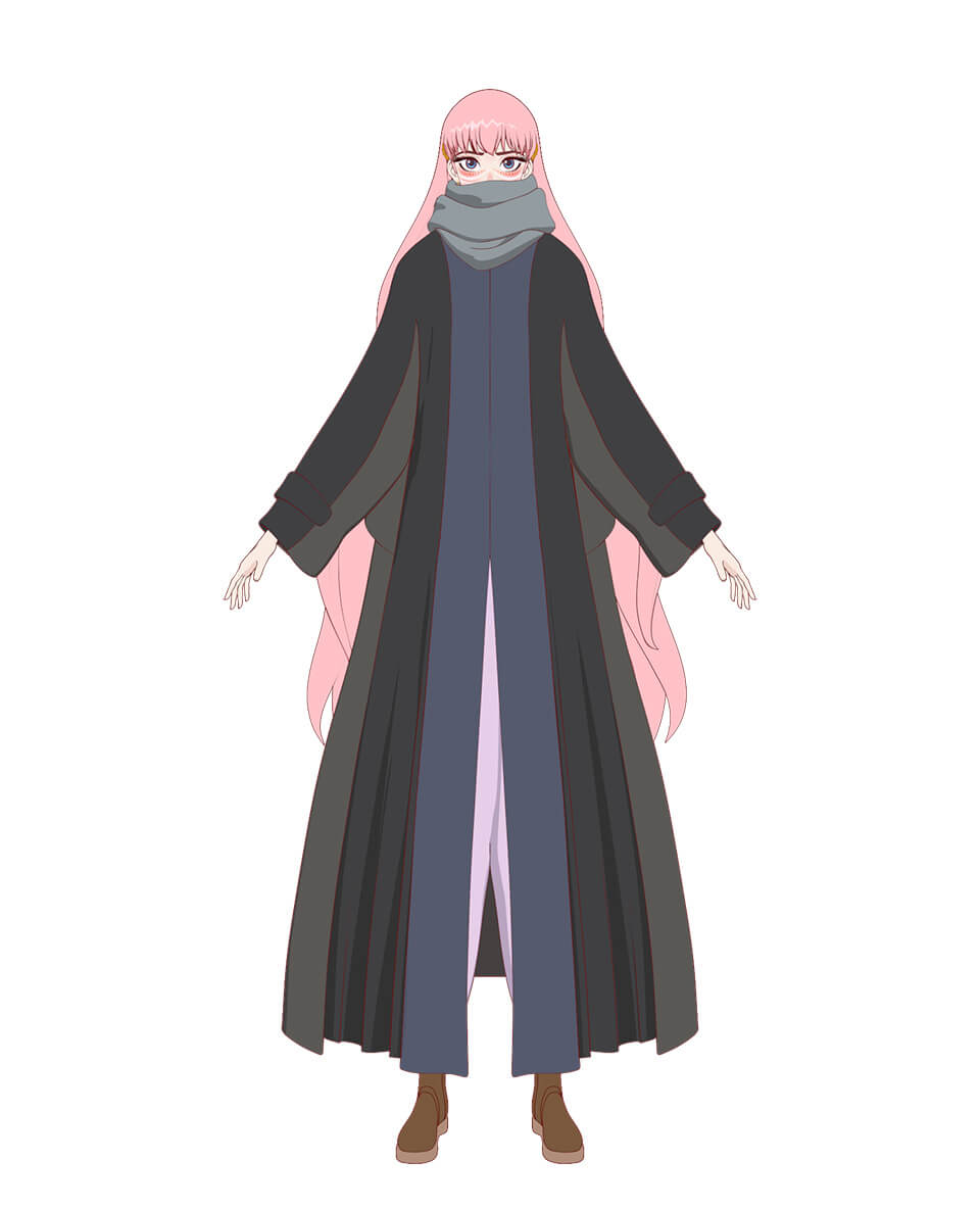


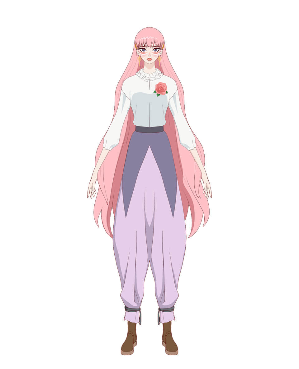
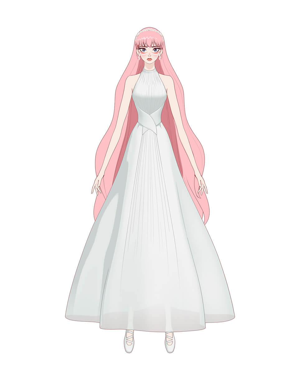


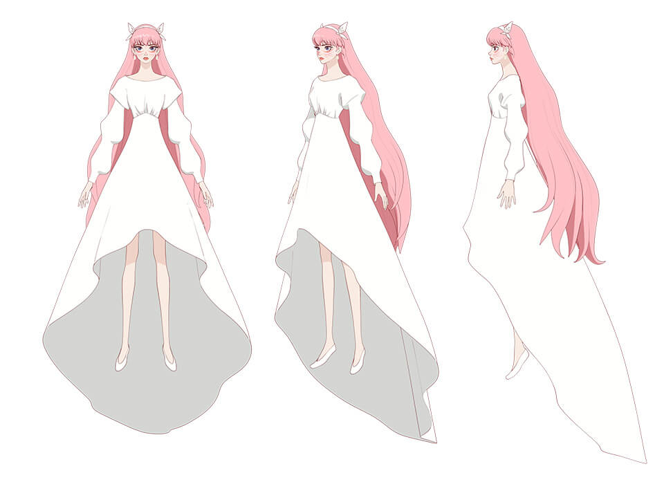
- Cap20:Belle’s costume variations
- Cap20:Belle’s costume variations
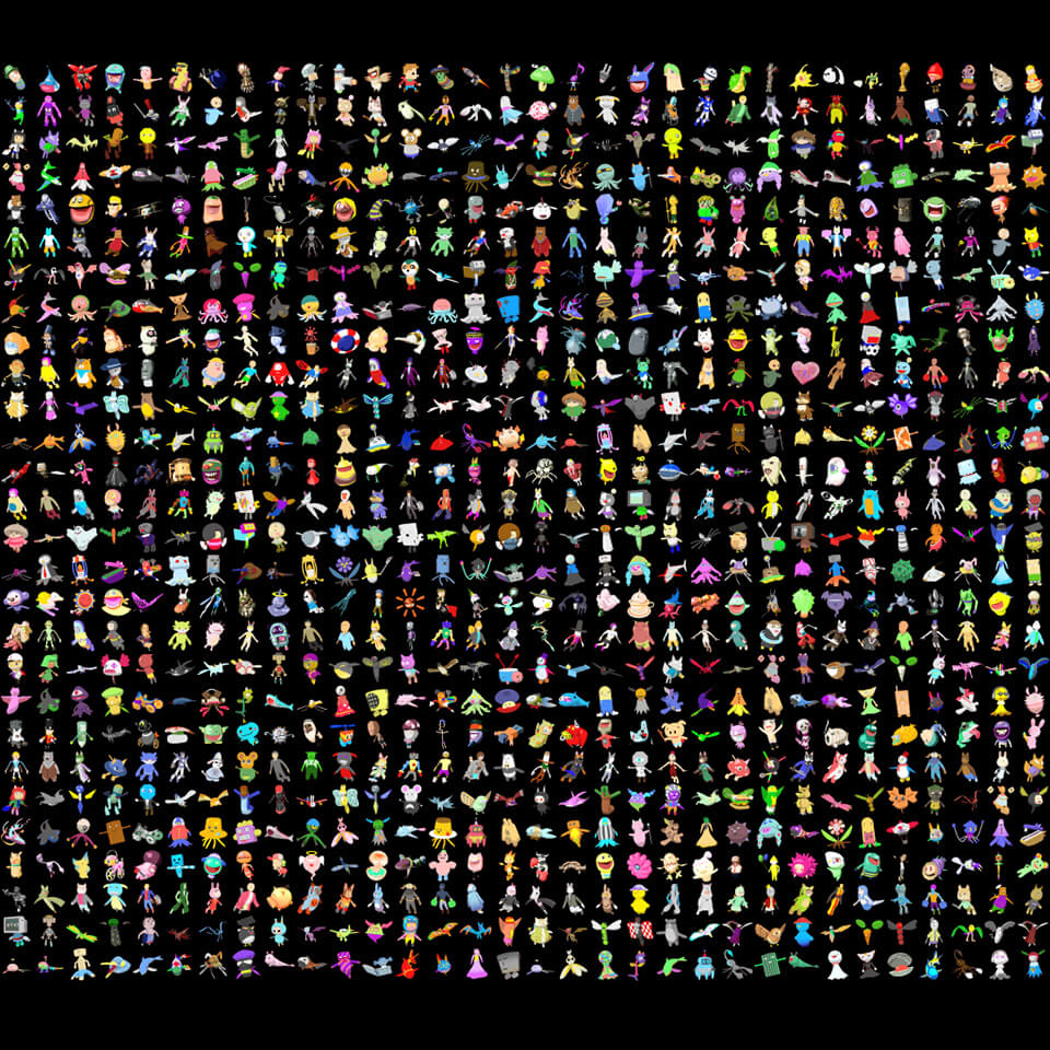
Crowd character production
A large number of user avatars As appear as crowd characters in U. How were such a large number of crowd characters created in a short period of time? According to Mr. Sato, the crowd characters in the background, middleground and foreground were created differently so that animation could be done efficiently.
The world of U was to be created to be a more scaled-up worldview than "OZ" from the previous work Summer Wars, so we needed to determine exactly how many characters would be required, which I would say was tricky rather than hard work. When we actually laid out a large number of crowd characters, we needed to make fine adjustments for color balance, scale, and other aspects that were not quite as imagined. We worked closely with Mr. Iida and the Setup Team and separated the background, middleground and foreground characters. We designed the middle ground crowd characters so we could run crowd simulation with Miarmy. There are roughly 300 types of middleground crowd characters. Freestyle modeling would be too costly, so they were designed with just eight types of joints to look uniform when they were laid out. The foreground crowd characters were done as models moved by animators using keyframes, and although not as detailed as the main characters, about 40 of these were produced with good enough quality in close-ups.
 Cap21:A crowd character used in the foreground for keyframe animation
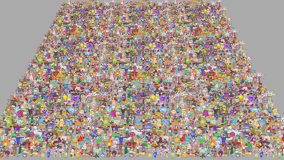
 Cap22:Approximately 300 types of crowd characters created for the middleground
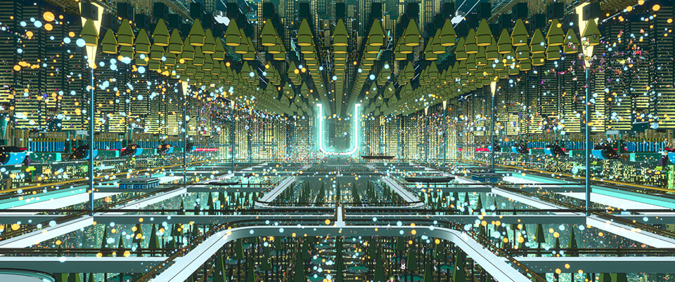
Background production for U
The director requested a geographic space when producing backgrounds in U, which expresses a vast space. Background Lead Tsubasa Harikae and Mr. Shimozawa describe their production process from conceptual production to actual production of U.
We received art designs and 3D models for the backgrounds in U from architect/designer Eric Wong, and the backgrounds were produced mostly based on the data Mr. Wong provided. The world of U is vast, with a roughly 10 km stretch from one end to the other end of the building cluster. The data size is too big when laid out in one scene, so we organized the data into the smallest unit we calculated and redid the layout. We received art designs for backgrounds, but the final look had not even been drawn at the initial stage, so decisions were made in discussions with Mr. Shimozawa.
The director’s keyword was a “graphic image” for backgrounds. With that in mind, we went with using composites, rather than 3D models, to produce a graphic representation. In order to have Mr. Shimozawa plan the composites, we first rendered various background models of U based on materials and handed them over to Mr. Shimozawa to create the final look. That was around July 2020. I recall deciding on a look at the beginning, while imagining the background in the opening scene of the film. At that time, the Animation Team had not started working on the project, so at the Background Team, we set up a provisional camera to work with.
 Background Lead, Tsubasa Harikae
 Cap23:Final look of the opening scene
One unique feature, which only applies to the city area of U, was that lighting was not used in 3DCG. We used a technique where we first calculated the normal direction of the model and color shadows and highlights on the composite. Then we output the mask for each small part and colored it. This is different from the kind of beauty rendering in 3DCG In fact, there are no shadows in U. Shadows make the image too busy, so we disabled shadows. We added colors using gradation and mask data, making this a truly graphic work. There is a range in the director’s idea of “graphic,” and if you depend on 3DCG rendering when thinking about which part would look best in what tone, you would run out of time. For that reason, deciding colors on composites was better for cost performance and because scenes are at different times of day, I concluded that it was better to design lighting for each scene on the composite. Once the look was decided at my end, the master comp was created with NUKE and handed over to the composite staff to organize; that was the flow.
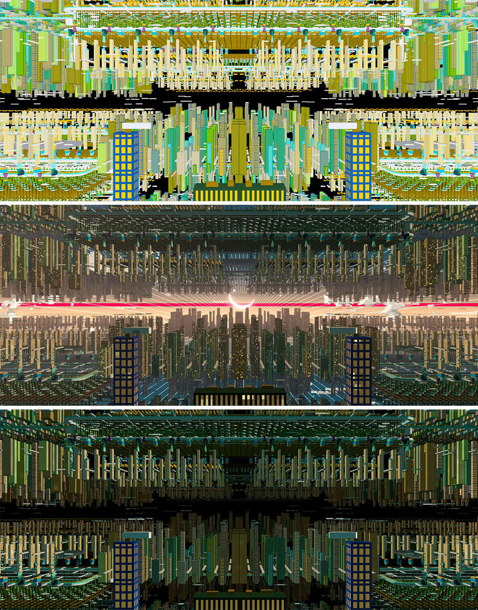
 Cap24:Rewrites comparison of U City
The background concept consists of three major parts: the city area of U, the exterior view and interior of the Dragon’s castle, and nature backgrounds along the road to the castle. The nature backgrounds were designed by Cartoon Saloon. The production of these three background parts had completely different workflows.
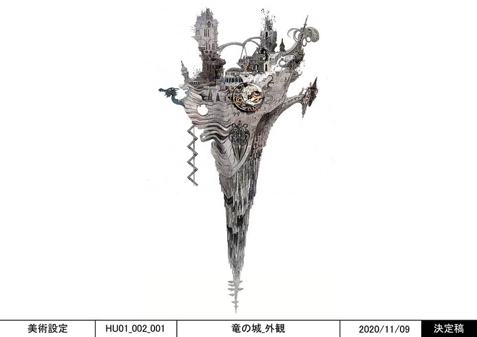
The Dragon’s castle
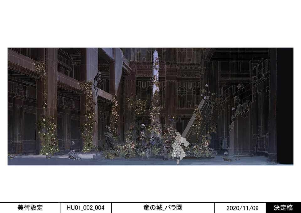
The art designs around the Dragon's castle were done in the hand drawing style but the interior was rendered quite realistically. With art designs like these, we did not know what kind of look we would end up with, so we first needed to decide on a look. Looks needed to be established early on because they would dictate the amount of required textures and shading. Background models for the Dragon’s castle had to be created from scratch. This involved the steps of making positioning models and making high-poly models, and we spent quite a bit of time before deciding on each look. We first look we worked on was the look for the rose garden inside the Dragon’s castle. For the look of the interior, the Background Team output materials from 3DCG which were refined in the similar manner to Nuke in After Effects. To add contrast to the background in U, we added lighting and shading and created a graphic look. For background modeling, we used Maya, as well as ZBrush and Blender.
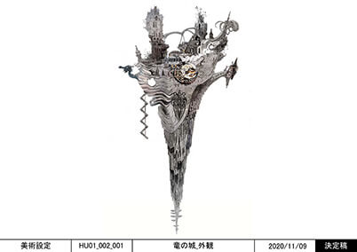 Cap25:The Dragon’s castle - exterior design drawing
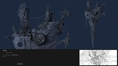 Cap26:The Dragon’s castle - exterior design model
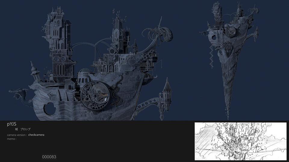
 Cap25:The Dragon’s castle - exterior design drawing
 Cap26:The Dragon’s castle - exterior design model
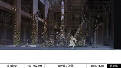 Cap27:Background design drawing for the rose garden in inside the Dragon’s castle
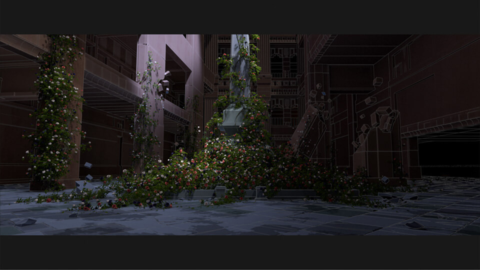
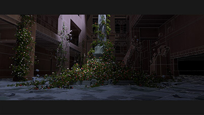 Cap28:The rose garden image made with shading in symbolic juxtaposition to the city area
 Cap27:Background design drawing for the rose garden in inside the Dragon’s castle
 Cap28:The rose garden image made with shading in symbolic juxtaposition to the city area
The castle interior is unlike U’s background, with lighting set up on 3DCG. We used a technique where backgrounds are rendered with some texture and then stylized on composites. This approach is a little different from how we worked on U’s backgrounds. When deciding on the look of the castle interior, it was no just about models and shading. The director requested a space that was beautiful but also tattered, which would lend it an aesthetic sense. When I was thinking what that might look like, I thought it could perhaps come in the form of noise. For example, something with a polygon that was a broken polygon or its peak pulled and stretched, or with chromatic aberration. We intentionally selected and used these “noise elements,” which are normally undesired in images, as graphic elements. We designed a look based on the idea that these elements project the Dragon’s dark mood.
While backgrounds for “the road to the Dragon’s castle” created by Cartoon Saloon were concept art, they included details of a quality that allowed them to be readily used as background art, so we used them as they were. The use of color is stunning. When used in cuts, we separated the concept art images we received into layers and built three-dimensional structures, but the majority was used as background as it was received. We learned so much in image creation.
 Cap30:Concept image designed by Cartoon Saloon
When background assets are done, they are handed over to the Animation team (a step called publish), but there was a lot of work involved in changing background positions for each cut. U’s space was large-scale assets requiring a change in camera position for each cut. They could not all be done with light data, and we often needed to replace assets with the high-poly versions when the camera zoomed in. Initially we estimated that 10 patterns would be enough, but actually prepared more than twice as many. Detailed work like that was quite labor intensive, but the resulting visual quality was worth the effort.
 Cap31:U’s cityscape
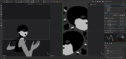
Production of effects that paint U
The effects that extend across the entire space in U are very appealing. Effect Lead Takahiro Matsui and Mr. Shimozawa describe the production concept.
As you can see from the pictures, representations of As crowds required the greatest amount of effects work. There was a huge amount of material to work on. The next most common, which we called “dots,” was the effect of particles that shine in the U space. We worked to represent the dots in discussions with Mr. Shimozawa. We spent a fair bit of time working on representations of crowds and dots through trial and error.
 Effect Lead, Takahiro Matsui
These dots were key to expressing the U environment and quite abstractly represented in that they sort of looked like city lights but also looked like interspersed data or halftones. We planned the dots to be made with that particular concept from the get-go, but when it was actually time to use them in shots, they were difficult to position and gave the Effects Team a hard time. The team made fine adjustments for each shot.
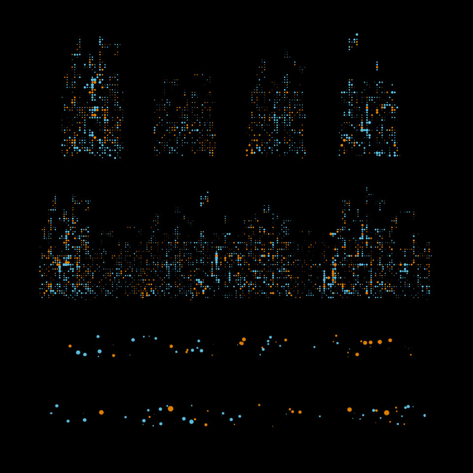
 Cap32:Examples of dot effect material variations used in U
It took a lot of effort, but it was worth it because the effect is simple but impactful when looking at the finished work. Another challenge was the crowd in the shot where As start swarming Belle. The crowds we in the Effects Team worked on were basically in the background, but we prepared 900 or so types of character images for the foreground As, which were treated as sprite particles. Then, we represented the background As, not as sprites, but as particles. The shot of a sphere that formed by the swarming crowd bursts looked particularly amazing, but unfortunately it was hardly visible from backlighting that was necessary for staging.
 Cap33:Sprite materials of the crowd characters in the background that were also used in the foreground
 Cap34:Background crowd particle materials created using Houdini
 Cap35:TOP The shot rendered, BOTTOM The base particle materials

 Cap34:Background crowd particle materials created using Houdini
 Cap35:TOP The shot rendered,
BOTTOM The base particle materials
Another interesting effect are the floating lyrics around Belle when she is singing. Initially, we created tests using Houdini to reproduce the effect of the atmosphere depicted in the storyboards. We created a few test variations to find the final look. During this process, the director suggested we take inspiration from the atmosphere created by effects in the movie INNOCENCE, so we used some images for reference. Many variations had to be created and reviewed for every single effect, so deciding on the final effect was a long process.
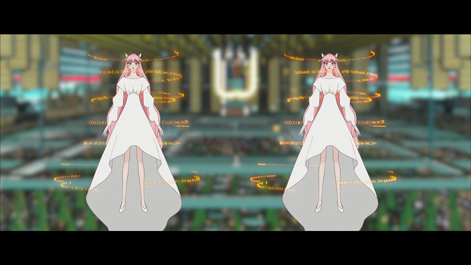
 Cap36:A test image of rings of lyrics circling around Belle
As with any work, the tricky part is figuring out how to create something from an abstract order.
The unveiling of Belle took place in a space containing nothing but her, and the background had to be created with effects. I had image materials from Mr. Shimozawa for the unveiling effect, but this shot was a challenging one to work on, with a lot of trial and error.
For this shot, the director requested effects echoing the images in the episode of accidental drowning of Suzu’s mother, so the effects were water, bubbles, streams of light, and things like that. In the beginning, it was hard to figure out how to capture the image, so I created a concept and had the team work on the effects. Even so, it took some time to fine tune movements and appearances for this shot. For this project, there were many long shots involving effects, so we readied ourselves to tackle them based on concepts. Despite the preparations, we were short on time for the length of these shots, so it was rough going for effects and composites.
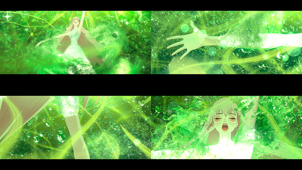
 Cap37:A scene with the background fully composed by effects
How to run shot production efficiently when all the work involved is moving in parallel
The team responsible for creating the final look for each shot is the Shot Team. At DF, the Shot Team has creative ways to efficiently run shot production, mechanisms that allow them to control lighting in composites, and other ways to help their work move along. Lighting Lead Hiroki Ando explains shot production.
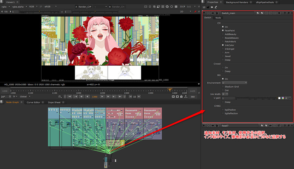
There are about 16 people working on lighting production. Shot production began around December 2020. We first needed to complete the teaser for this film, so that’s where we started. The number of shots produced before delivery was 658 cuts, so we uploaded about 50 cuts everyday, and maybe 40 percent of those would get an OK. Retakes continued through to the final delivery in July. Our shot production workflow started with organizing the layout of each cut as we received it, so that we could review them with Composite Lead Onodera. This task was not simply about organizing, but also about selecting the cuts that would steer production and collecting similar layouts. For example, the Dragon’s castle cuts are organized by the time of day and the area. We created cut sheets for each scene. Cuts that had Belle in them were assigned A, cuts that had the Dragon in them were assigned B, and so on, so that the same shot artist could work on the same character as much as possible.
 Lighting Lead, Hiroki Ando
 Cap38:A sample layout
 Cap39:Rendered image of a shot with lighting
 Cap40:Final image with effects and relighting
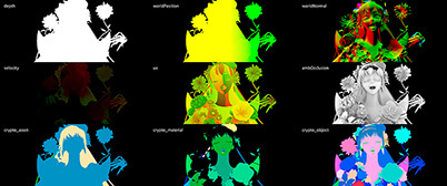 Cap41:Various masks using world normals as shown are output and used for relighting

 Cap40:Final image with effects and relighting
 Cap41:Various masks using world normals as shown are output and used for relighting
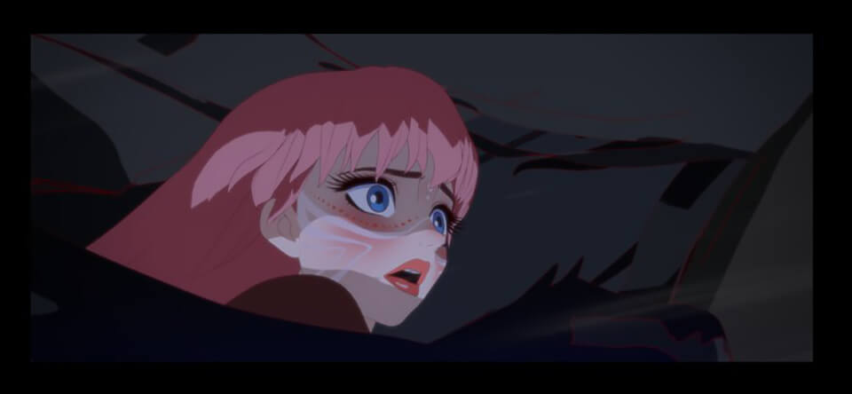
For production reasons, the Character, Background, and Animation Teams were working in parallel for this project, so we were mindful to minimize wasteful work. The Shot Team is also responsible for lighting, but this film had looks that were done in toon shading with little gradation. If lighting moves or a character moves, it creates unintended gradations. So we drew shadows that matched layout intentions into texture and created a table of the texture to use for each layout to help maintain consistency in shading. One unique feature of lighting in this film in contrast to the previous animation projects is the use of light links. Light linking is a technique for lighting individual parts, such as hair, body and costume. You can produce a finish with shading that’s close to how it's drawn in a layout by adjusting lighting for each part. In the past, the shots that had two characters in them were produced by rendering each body and creating a composite. But with light links, two bodies can be rendered at the same time, so we used this technique to reduce the number of materials as well.
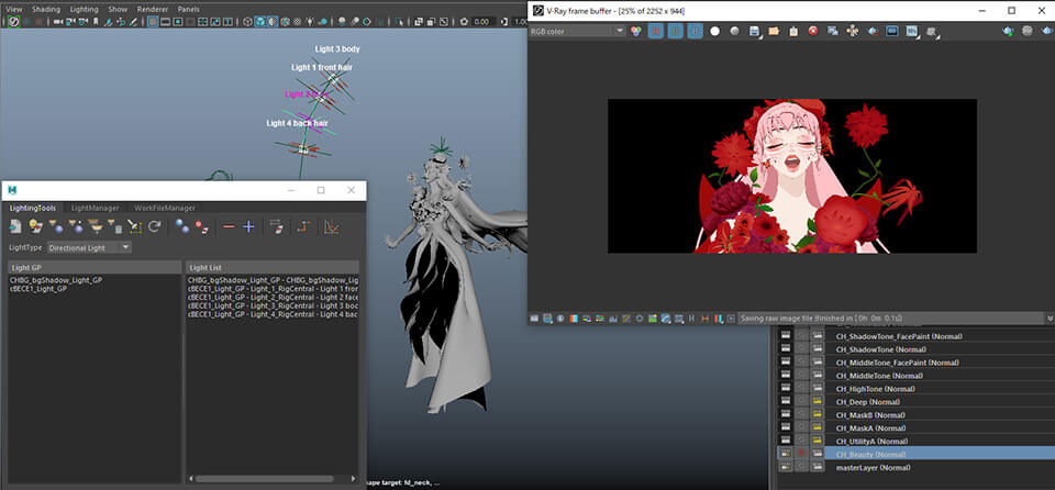
 Cap42:Light link setting image with light positioned at each part of a character
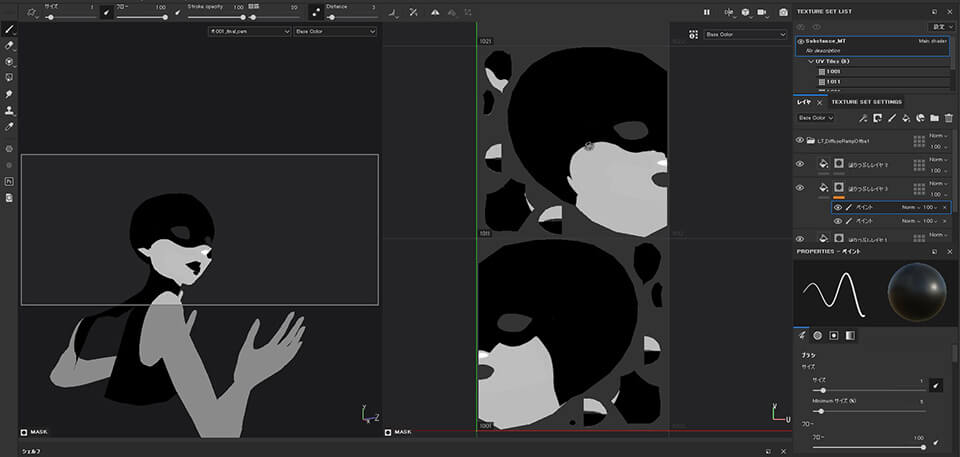
As for lighting, contrast instructions for each layout can often be difficult to reproduce with lighting alone. In these cases, we use Substance Painter to add contrast data into texture. In addition, when there are details such as characters’ hair that would be expensive to reproduce with CG, we used Photoshop to draw hair as a material and create a composite.
 Cap43:Texture gets swapped based on the layout
 Cap44:Example of drawing shading into texture based on the shot
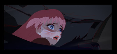 Cap45:Final image of a scene with shading
 Cap44:Example of drawing shading into texture based on the shot
 Cap45:Final image of a scene with shading
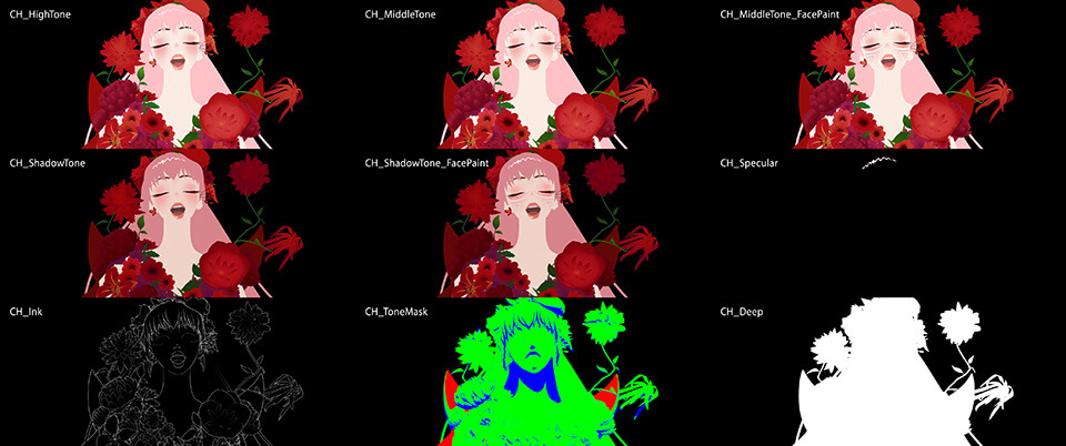
For the materials used in this shot production, we rendered intermediate color, shade, and highlight materials without using so-called beauty materials. We used a mask material with green for intermediate color, blue for shade, and red for highlight to create a look on a composite. We then added ink lines over the look to finish it. We used NUKE for composites, which were created in such a way that a provisional composite can be built by selecting the scene location and other conditions, so that anyone can easily view an image that is close to what the finished version would be.
 Cap46:Rendering materials output for gradation color adjustment on composites
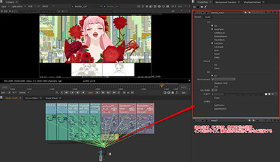 Cap47:NUKE operation screen simplified to allow checking in a composited state
 Cap46:Rendering materials output for gradation color adjustment on composites
 Cap47:NUKE operation screen simplified to allow checking in a composited state
Efficient composite work with NUKE
Lastly, Composite Lead Tasuku Onodera talks about compositing. For this project, compositing tool was changed from After Effects to NUKE. Mr. Onodera explains his passion for compositing.
Unlike our past works, we used NUKE as the main tool for compositing in this project. We often used After Effects as the main tool, but because the Shot Team was more proficient in NUKE, and given that it’s easier to get a grasp of the overall structure of composites, we went with NUKE for work efficiency. As described earlier, lighting had not been applied to the space of U and it's produced on composites. We use data on normal lines (worldNormal) output by the Lighting Team for relighting. This is the end of the first step in compositing. From here, we add parts with brightness, such as the light coming through a window, and manipulate a sense of depth and overall contrast while adjusting shading to finish an image. One benefit of using worldNormal is that, although sometimes relighting information cannot be applied to other cuts as you would expect, and in these situations you would need to readjust the image, generally, relighting information that has been output for one cut can be applied to other cuts. For example, the lighting in U’s space changes depending on the time of day. We used relighting information to create the concept for the look of each period of time, which served as references in this production.
 Composite Lead, Tasuku Onodera
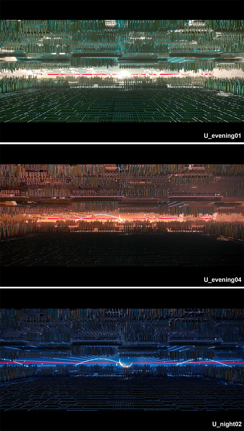
 Cap48:Representations of U’s space by period of time
(TOP: noon, MIDDLE: evening, BOTTOM: night)
My favorite cut in composite is the shot of Belle riding a whale. This shot appears at the opening and the ending, and the two cuts are linked. We carefully linked the scattering of a lens flare in the opening shot and light ghosting of the ending so that they mirrored each other. We used live-action effect materials for the light ghosting effect. I think the use of the live-action effect materials resulted in stunning images.
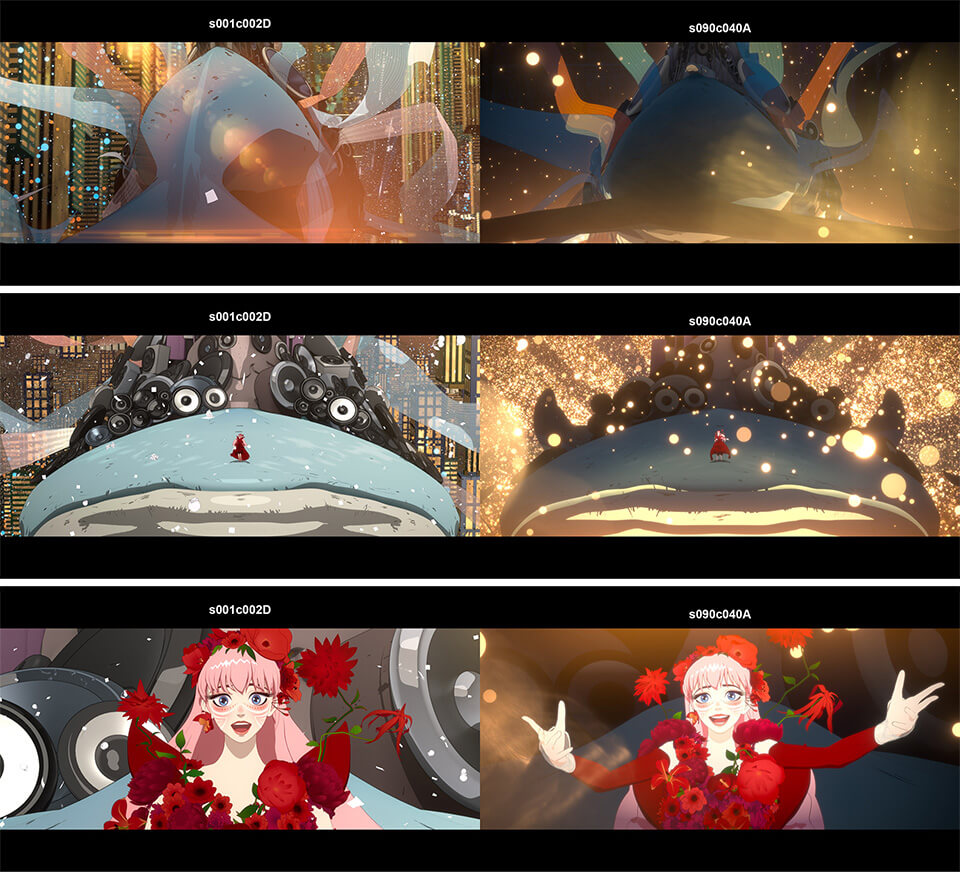
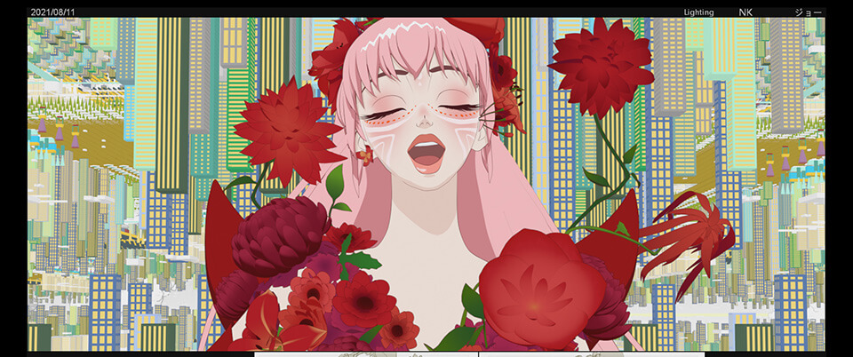
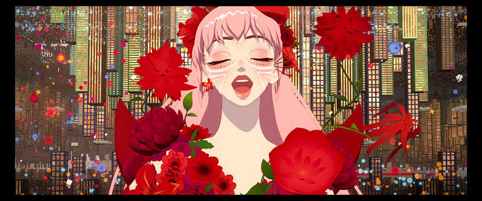
 Cap49:Contrasting images of Belle singing in the opening and closing scenes
(LEFT: the opening scene, RIGHT: the closing scene)
SATO
We received Belle’s model from Mr. Kim and went from there to figure out how to build her character. Mr. Kim’s designs are of very high quality. There was pressure to build a CG model without any loss of quality. The director also wanted us to retain Belle’s facial expressions and the impression of her eyes, so the major challenge was to build a CG model with an Anime style. After this design, we also received another design from CG Animation Director Yamashita. This second design was Mr. Kim’s design refined by Mr. Yamashita in his (Anime) style. I thought it would be difficult to balance a Disneyesque design with Japanese anime-style toon shading, so there was a lot of back and forth with Mr. Horibe as the project went along. Character Lead, Suguru Sato