Digital Frontier
Header
Main
CG MAKING
Death Note: Light up the NEW world
October 2016 [VFX]
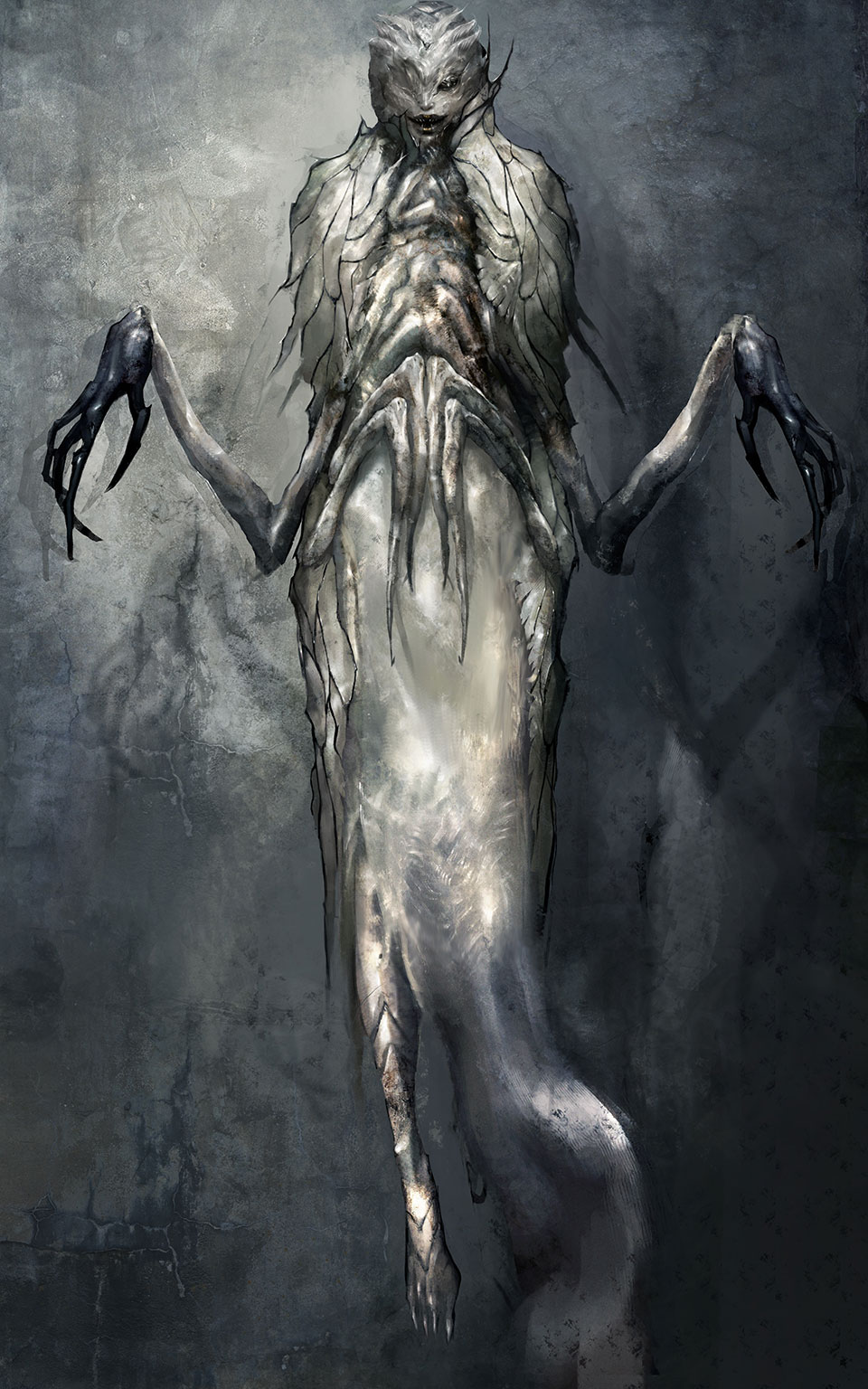
The Re-creation of the CG characters based on the concept art
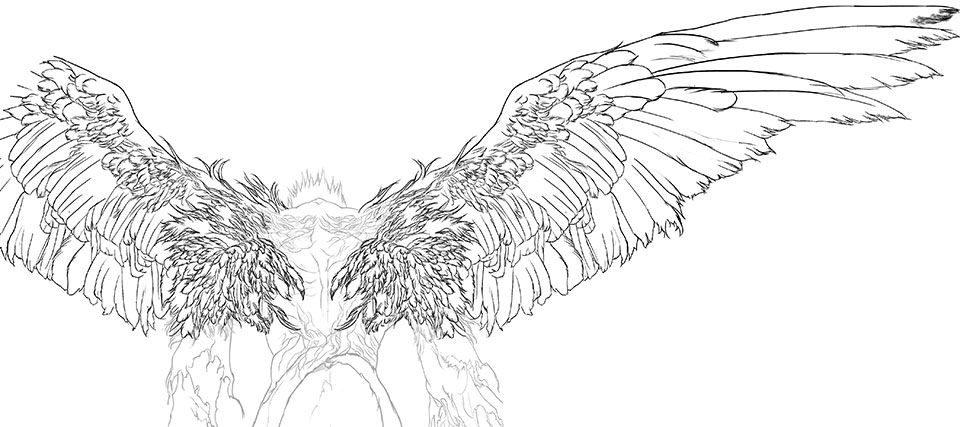
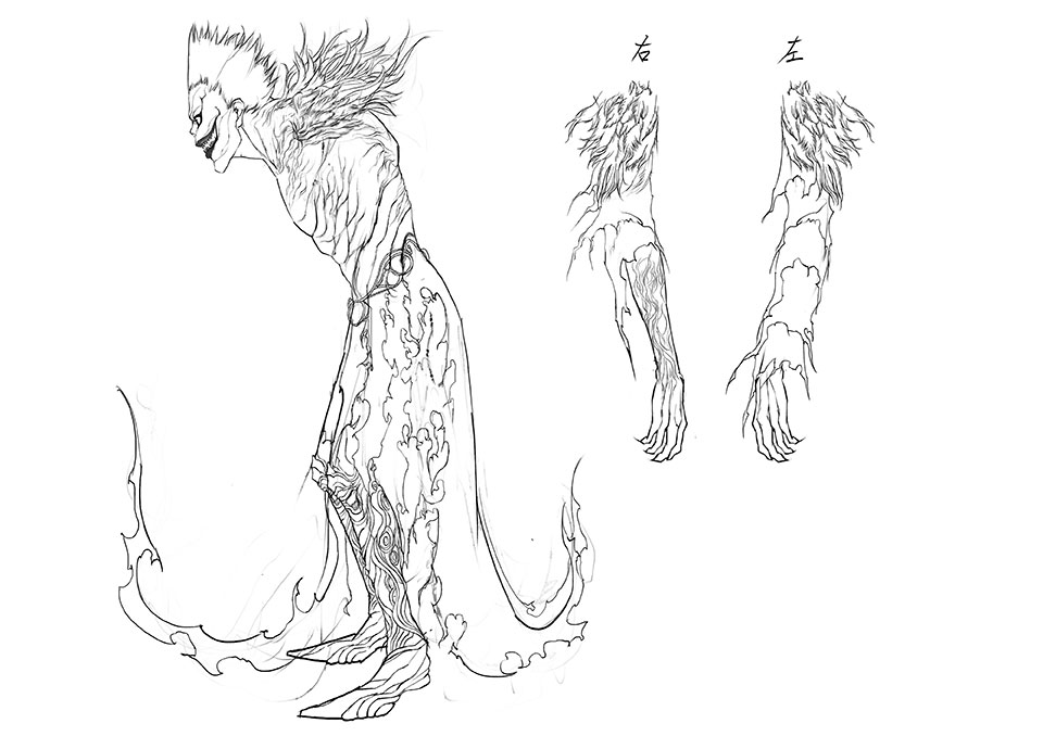
The concept art provided the guideline for the new Ryuk’s image. But in order to turn this design into a CG character a number of steps were needed. Shuji Miyao, the lead character artist for Ryuk, said “When I first saw the design I thought it was incredibly cool but I wondered how in the world I’d bring this to life in CG.”
So that the team could understand the structure of our design, we created a three orthographic view line drawing. We drew the initial design without thinking at all about the work necessary to create it in CG so I think we made Miyao struggle to create elements like Ryuk’s fluttering feathers (laugh). This was the first time I was given the opportunity to do proper character design work so I really learned about what is necessary to do to transform things into 3DCG. Things such as the inability to complete a character model using just a front view image - since the design has to look consistent when you look at it from the side and from back. And the fact that when you choose textures you need to explain them in a way that’s easy to understand.
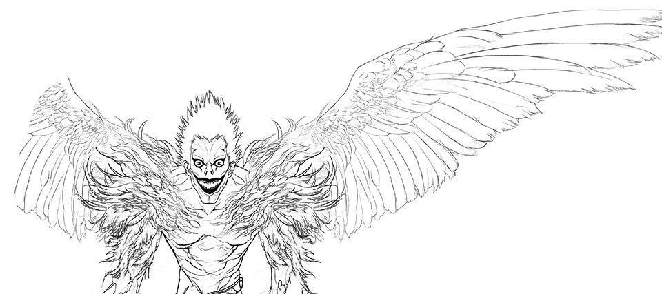
Conscious of the need for realism, not only was the concept art was drawn with fine detail but the completed 3DCG model was as well, with facial wrinkles etc. In comparison, the Ryuk from 10 years ago looks extremely simple.
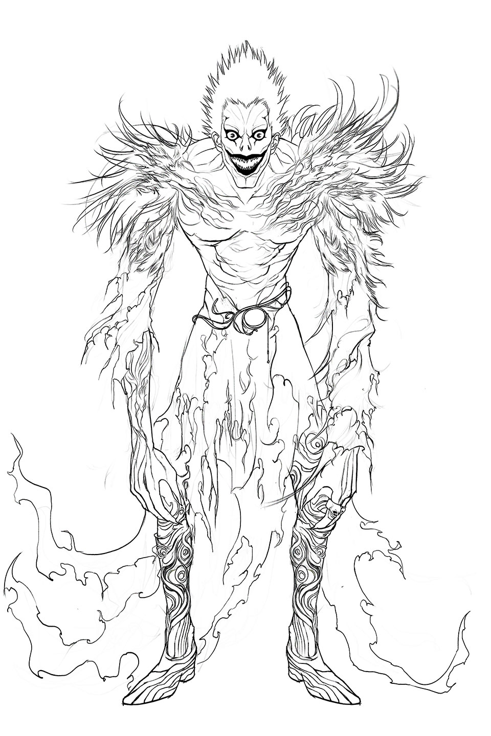
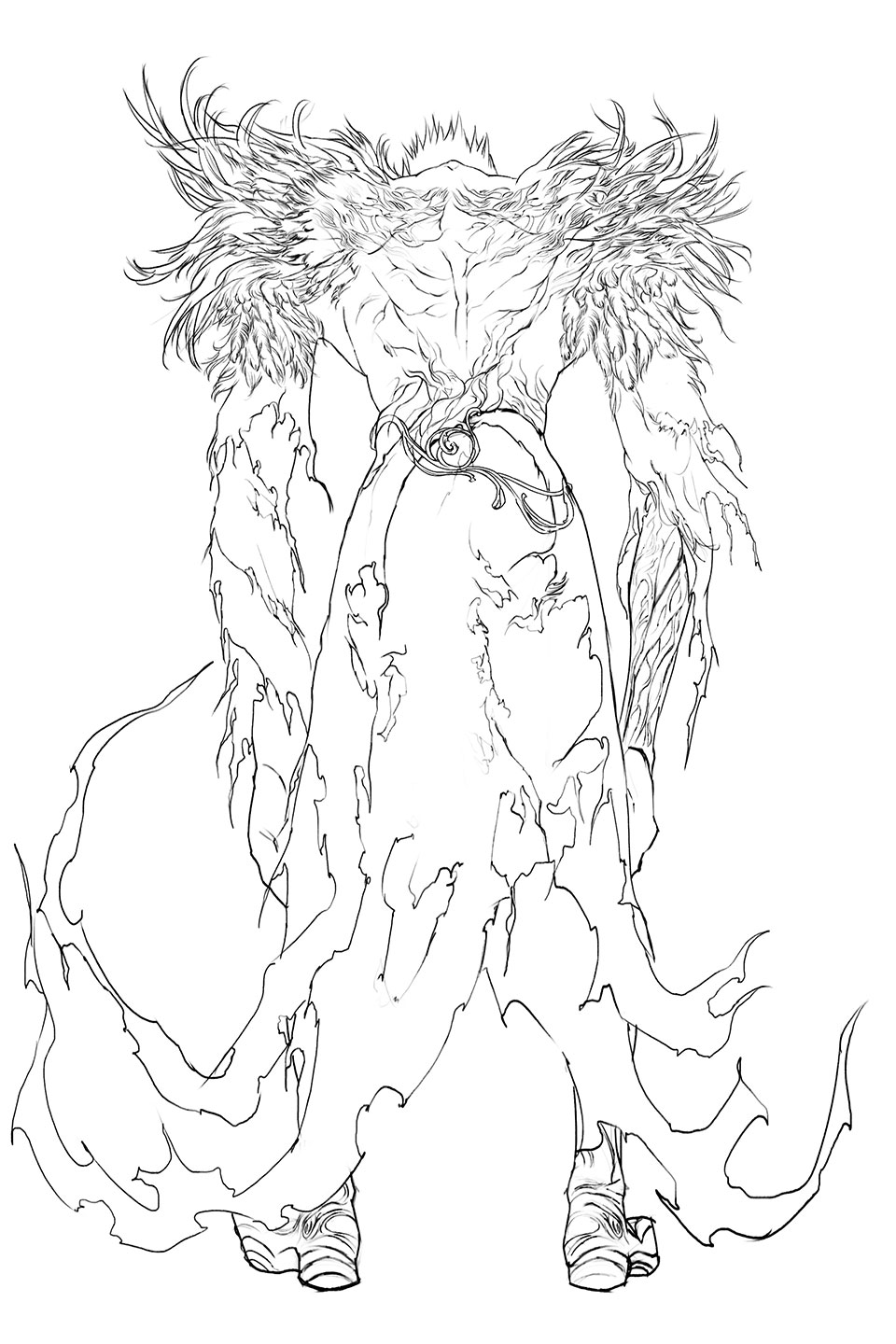
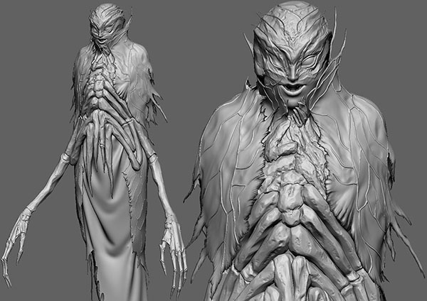
 Three Orthographic View Line Drawing of Ryuk 1
 Three Orthographic View Line Drawing of Ryuk 2
 Three Orthographic View Line Drawing of Ryuk 3
 Three Orthographic View Line Drawing of Ryuk 4
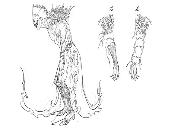 Three Orthographic View Line Drawing of Ryuk 5
- Three Orthographic View Line Drawing of Ryuk 3
- Three Orthographic View Line Drawing of Ryuk 4
- Three Orthographic View Line Drawing of Ryuk 5
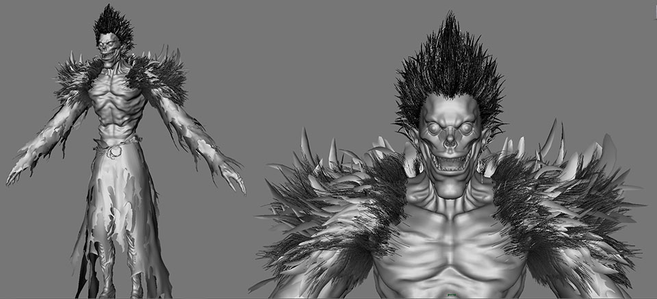
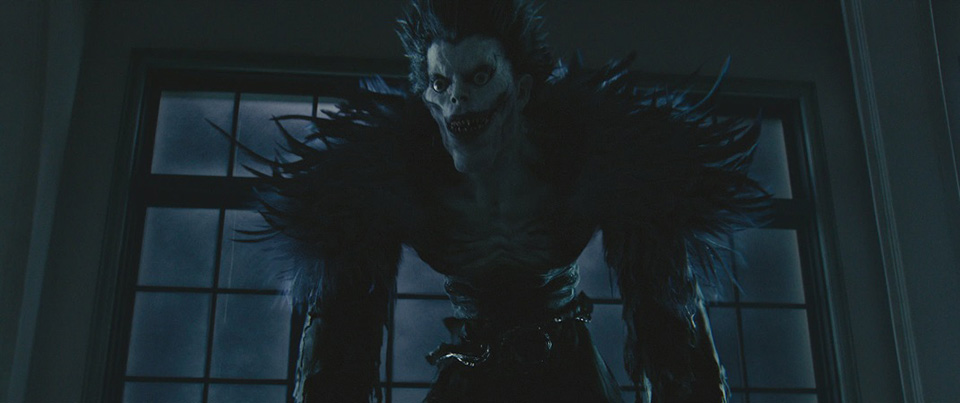
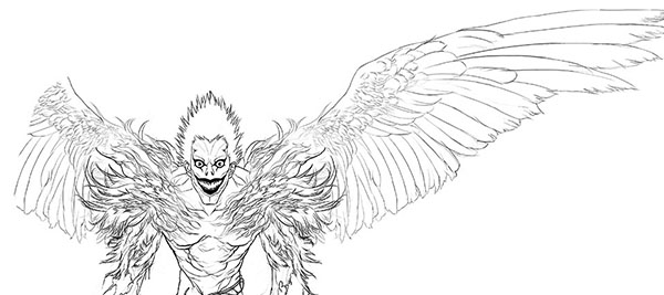
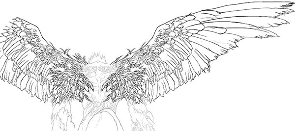
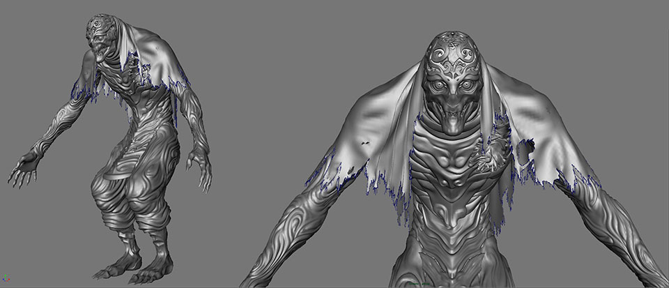
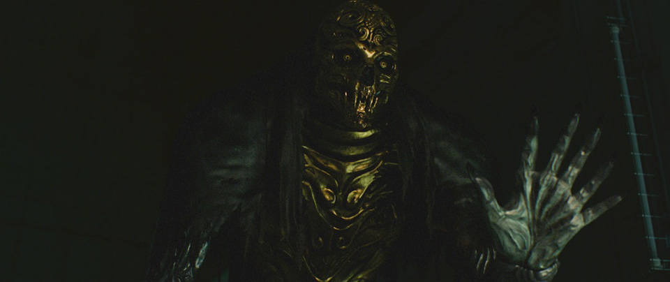
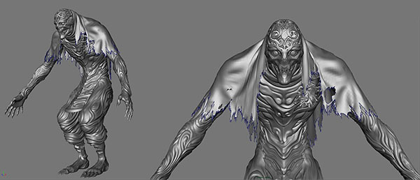
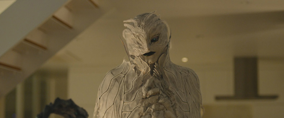
 Image of Ryuk’s CG Model
 Ryuk
Ryuk
A new character not from the original manga
In the film’s original story, in addition to Ryuk new death gods named Arma and Bepo also appear. Both death gods were based on Takatsu’s concept art designs but in order to adhere to the world of “Death Note”, different death gods from the original were used as references.
When designing Bepo, the team requested that I use the death god Dalil=Guillohrtha from the original as a reference point. Dalil=Guillohrtha’s whole body was an ornamental type of design so it was easy to design. I suggested that Bepo wear a head mask made from metal and that its whole body be covered in ornamental patterning. I got the OK for the design easily but it was a little difficult for me to communicate my design’s textures to the CG artists. It wasn’t the metal texture of the head but the texture of the body that posed the most problems. The original Dalil=Guillohrtha had a body that looked and felt kind of like rubber. But I wanted a texture similar to amezaiku (the Japanese art of candy sculpture), with a body that wasn’t as hard as metal but also wasn’t as soft as rubber. As the production team and I went back and forth, I was reminded of how difficult it was to design for CG. Luckily, I was allowed check and give feedback on the texture on multiple occasions.
-

Completed Bepo Concept Art

Completed Bepo Concept Art
There was actually one aspect of Bepo’s 3D model that the director was emphatically particular about. Something you probably won’t notice if you see the film just once.
In Bepo’s concept art, the character only has 5 fingers but in the actual film it has 6. The director wanted to use the character’s hand to depict the number of death notes at a glance when Bepo reveals, “six death notes exist in the world”. Although we had to change the 5 fingered Bepo model to 6 at the last minute, we felt that the director’s insistence left a strong impression in the scene.
These creators were so passionate about their work that they even perfected areas that no one will notice. When you see Bepo in the film, please be sure to check this out.
 Bepo’s CG model
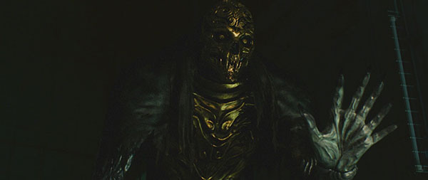 Bepo
Bepo
On the other hand, Arma’s design was faced considerable difficulties. She was an important character in this film and had many interactions with other human characters.
The team requested that I use Shido, an insect-like death god from the original, as a basis for Arma but change his sex to a female. Shido’s body was already slender so Arma’s female body was easy to design. But I became really worried about how in the world to take Shido’s eerie, creature-like face and make it more feminine. I must have redrawn the design many times. This character took up most of my time.
Even in the original manga, Shido was the type of death god that appeared very often. He had a lovable personality, but looked like a monster since his face modeled after an insect pupa. To rebirth this character as a beautiful, feminine Arma, it was necessary to take considerably bold steps.
The face ended up looking closer to a human’s and we designed it such that he looked more like a beautiful Western female. Initially we got the OK for our design but afterwards the team thought that a face that was too human had less of an impact so we reverted to a more slightly Shido-like facial design and arrived at the design you see in the film. Since we took so much time on it, for me this character ended up having a special place in my heart.
-

Arma Concept Art - Completed Version

Arma Concept Art - Completed Version
The final Arma has the features of a grotesque creature while maintaining an elegant feminine beauty. In fact, she has a design you could be used as art for a fashion brand. Her silvery body also reminds many people of the death god Rem from the previous film. So there is no doubt that nostalgia for Rem will help Arma win over new fans. Arma’s insect wing, cocoon-like transparent textures give her sense of fragility. But the creation of these textures created difficulties for the lead CG character artist, Naoto Ikeda.
In CG when you talk about making something transparent, it increases the amount of information and creates significantly longer rendering times. We discussed making the textures opaque but in the end we decided to follow the style of the initial concept art. We also encountered some hardships when dealing with the parts of her body that can be seen through the transparent texture. But since Arma stands in a straight pose throughout, the construction of her model went pretty smoothly.

 Arma’s CG model
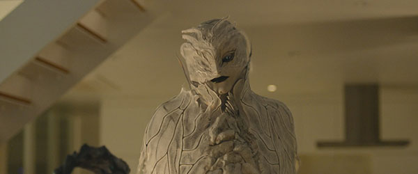 Arma
Arma
Rendering is the process of taking data and creating an image or a shot. Transparent object surfaces increase the image information and result in much greater file sizes compared with opaque object surfaces. And when you deal with larger files it creates more work hours and a sudden jump in production costs. Compared to the film from 10 years ago, computer processing power has significantly increased but teams still push to do the most they can within a given budget and timeframe.
Machine specs and software performances have improved compared to 10 years ago, but the biggest change of all has been the introduction of ZBrush software. When you use ZBrush, it’s so much easier to mold things such as facial wrinkles. But since model detail is easy to create it’s also easier for the information volume to increase compared to 10 years ago.
The creation of the “Death Note” world by the “Death Note” generation.
Ikeda and Miyao unanimously said that implementing a workflow that depended on concept artists was incredibly helpful.
When we didn’t have an art team, the director would draw the concept art but depending on the director there would be deviations in the final designs. And occasionally there would be times when the director would be forced to follow a 3D artist’s discretion. But when we can get the type of art we received for this film, the end goal becomes clear and we can move forward without worry.
Furthermore, it’s a big deal to have an in-house concept artist. Before this we’d often receive designs from outside artists. So it wasn’t possible to directly ask for the opinion of the person whose design we were working with. Nowadays, it’s helpful to be able to ask the art team about things like the texture of a material at any time.
I don't work with a fully 3D mind yet so I can’t think about things like a character’s internal structure when I design. So I’ve had to rely on the veterans around me to fix the inconsistences caused by missing fine details.
These 3 people, who also happen to be fans of the original comic/manga, got to experience something special working on this film. For Miyao, working on this film was incredibly sentimental since the Death Note from 10 years ago was the reason he joined the company. Perhaps “Death Note” is the type of story that will be passed from generation to generation. And perhaps the young viewers of this film will give birth to future CG artists who perhaps go on to create another new death god.
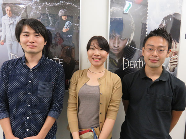 (From the left) Miyao, Takatsu, Ikeda
MIYAO
So Takatsu did me a favor and drew the design once more as a line drawing. As I examined the line drawn version, I was able to confirm small details and find a way to work through the CG version.